
From Wireframes to Design
Creating a Mobile Application Mockups
Website Wireframing Methodology
Website wireframes are grayscale line drawings used as blueprints during the development cycle. They help developers, designers & key project stakeholders build a shared understanding of site functionality before spending time and resources on design and development. In other words, wireframes define what the product will do when complete.
Key Benefits:
Wireframes are great if you are not sure how to best communicate requirements and specifications in a way that is easy to understand for all project stakeholders.
UI-interfaces design
Visual brand identitification on the site.
Interface design includes solutions of colors, shapes, background images, which are under the brand identity or corporate identity of the company.
Visual design of microinteractions is performed by creating a micro-UI elements.
Micro-UI is secondary elements of a smaller size interface relative to the main one, which carry additional information about the ongoing activities. For example, switching accounts in Android-application the Inbox displayed as a choice between two user’s photos of each profile. In the same application there is a micro- gestures – quick letter deleting.
Animation makes an interface more intuitive and can even specify some details of the design. An example of successful animation usage for interaction is design-concept of Material design from Google.
Animation shows the reaction of the interface on the vernal command from the user: press, click, gesture. The animation shows how the machine accepted the command and confirms its accuracy. For example, the element deliquescent circles in Android material suggests that a click/press happened and now commands are performing – will be opened the post on Facebook, start a music track, and so on.
Animation creates a responsive interface, teaches the user, generates his information waitings on work with the interface or application.
Also, animation combines several elements in the same context. As a result, the user understands that these elements may be involved in one operation, and focuses attention on them. Therefore, the animation is often used in primary submersion ot the user and interface promotes storing stroke action to accomplish the task.
Animation lets you save space on the screen and beat it nice: static element can hold the whole taskbar and open it only on-demand of user – pressing or click.
The princip of mobile first: first think how the interface will look and behave on a mobile device:
- in the first place – we show the importance of the content to the user;
- Mobile devices are used in areas with different connection quality, so the design and implementation should focus on optimizing for the mobile Internet;
- User-friendly interface for navigation in a mobile device;
- correct use of screen space;
- reducing the user time to perform a task or content production.
Interactive interface types, whose behavior indicates to the user the next action – these are wizards (wizard is a guide).
The need for wizards occurs when the user needs to achieve a specific purpose (eg, correctly fill out the profile on the site) must make a number of settings. The user himself can not cope with the task, because he does not know what data is needed for the system to work correctly. Therefore wizard “leads” him along the task, consistently showing the screen behind the screen, in which is needed to perform the action. The sequence of actions and a set of options for them are determined by the UX-designer, and UI-designer uses graphics and animations to make this interaction understandable, easy, and what is the most important – successful.
The knowledge of design implementation helps to prevent difficulties in development and contributes to the normal communication between teams of designers and developers.
We offer only unique design solutions, but with an eye to the possibility of their embodiment without functionality sacrificing, page loading and ease of use.
standard package of source files under web-development
- Source files ( Psd, Ai, Eps.)
- UX-card
- Patterns of UI elements are on request
What is not included in standard package
In stantard package are not included such services as design-support, marketing kit implementation.
UX-design interfaces
Interaction design
Sites dashboards, console for developers, control panels and other complex interfaces.
UX-interface designer tasks ares much wider than the visual solutions and they include the following:
- Designing of information and visual interface structure, the creation of navigation between pages, sections, and – within the pages.
- Creation of interaction between service and user by means of interface.
- Visual interaction design: facilitating the user experience through visual solutions.
- A single functionality interface for desktop and mobile devices.
- Developing of flexible design solutions for convenient work with the interface on all available devices.
Informational Architecture of the site/service defines an informational logic, construction of the whole site / interface and compliance of all its pages, sections with this logic. The architecture for maximum takes into account information user expectations, tasks, actions associated with the error, gradual and non-intrusive user interface training.
Prototyping is performed after or together with the development of the information architecture of the service / site. We create dynamic prototypes with demonstration of the basic functionality, transitions between pages and navigation. In the prototype the structure of standard pages, and user interaction with each page is also worked out.
Responsive interface is fully adjusted to the dimensions of the browser.
When designing the Responsive interface it is used a single layaut, blocks of which are rearranged depending on the device, and during the development HTML5 / CSS3, UI-library JQuery and minimally – JS are applied.
Adaptive layout design contains several layouts specifically for each screen resolution and, therefore, it is widely used JS, because some elements need to be hidden and some are shown.
We delivery standart package of source files:
- Sourse files ( Psd, Ai, Eps.)
- UX-card
- Patterns of UI elements are on request
 Design mobile applications for the iPhone and iPad
IOS operating system and the iPhone smartphone made a revolution in the mobile world. The user experience on iOS devices exists since 2007, and Apple itself sets the tone for the company in the development of mobile devices and technologies.
Mobile application for the iPhone and iPad have almost the same design standards (except those that are imposed by physical limitations of devices). Applications for iWatch wearable mobile devices (smart-watch) is also performed in the same visual solution with the iPhone.
There are a number of unique specifications from Apple on designing of mobile applications for iOS, which enhance user experience, leading mobile applications to a harmonious visual appearance and identical interaction on iOS devices.
Smart watches as a wearable mobile device, has a slightly different type of interaction because of its small size and use restrictions. Features of smart watches iWatch can be divided into several categories: notification, entertainment, sports, health, lifestyle. This is the main list, which will significantly expand. Working with Notifications is a priority task of smart watches, which they decide much more effective than the interaction with iPhone only.Smart watches have a very different applications navigation and gestures control. The emphasis of the application design is shifted to the control components, their movement, as well as icon design.
Standard package of source files for development
- Source Documents (Psd, Ai, Eps).
- Home application icon in the size of the application and promotional pages.
- UX-card application screens.
- UI-kit applications.
- Cutting graphics.
- GUI-document application.
- Used application fonts.
What is not included in the standard package
The standard package does not include design support service, works on marketing kit.
 Android Design for the mobile applications
Mobile applications for Android exist in mobile design since 2005. During this time, users have created a great experience, habits and interaction models, peculiar to this operating system.
The latest versions of Android are followed by the ‘Material Design’ concept, developed by Google in order to bring all of their products and services into a unique ecosystem. Material design mind is based on the natural physics of motion, expressed in animation, layered arrangement of elements, almost the full absence of volume and shine.
The material palette of colors – laconic, but despite this, the applications can be quite colorful and bright. The emphasis of the material design is branded button ‘Action button’ it is used only in the Google products and services.
СNow it makes sense to focus on devices running on the current version of Android Murshmallow, but not earlier than Android 4.4 (Kit Kat)
Slicing graphics
In order to “collect” the mobile application of the graphic layouts in full working product, the graphics should be sliced; it means that each element is to be cut as a separate file. The whole visual realization of mobile applications depends on correctly performed slicing, and the result – a beautiful and well-coordinated work of the finished digital product.
Slicing graphics is a necessary procedure, unloved by developers, so they are forced to use for work completely strange for their profession tools and means. Therefore, while completing the work on the project, our designers give to the developers completely sliced graphics with the accompanying documentation. Any developer, while opening our source files can immediately start to fulfill their tasks.
Slicing graphics is performed taking into account all the design peculiarities of top devices screens. Our graphics is adapted to the largest possible resolution and pixel density. Also flexibility is taken into account, which is especially important for the Android applications.
Running graphics slicing is not necessary to order additory. This service is an internal standard App2World projects implementation.
Design of the product icon
Product icon is one of the key visual factors that affect the user’s motivation to download the mobile app.
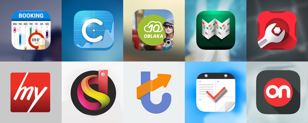
- client company tasks,
- users expectations,
- standard operating systems,
- current trends in mobile design.
The work begins with a sketch, drawing the appropriate choices from which the single image is approved on revision.
- For IOS: 29×29, 40×40, 58×58, 60×60, 76×76, 80×80, 120×120, 152×152, 512×512, 1024×1024.
- For Android: 36×36, 48×48, 72×72, 96×96, 144×144, 192×192, 512×512.
On approval are given icons sized no more than 152х152 px in Png format.
Usually application icons are provided in several key dimensions required as for application and for marketing publications.
After finishing the work we will give the archive with the icon in all sizes and source editable documents (Eps or Psd).
UI kit
UI-kit (User Interface kit) – a set of functional elements, which are dealed primarily by the user that defines the style, aesthetics and even products premiality.
First of all, for the UI-kit application it is:
- A visual implementation of application functions;
- A trended user interface;
- An opportunity of partial application design renewal by replacing obsolete UI-kit elements on more relevant.
Also, UI-kit is a set of parts of the user interface, which allows to implement all the functionality of the design ideas, customize the project, i.e. to adapt it exactly for the target consumer. UI-kit is a kind of accessories that give the general appearance of the application completeness and uniqueness, a single unique style and harmony with the operating system interface.
UI-kit is a kind of “brand book applications.” It includes all the dynamic elements (buttons, radio buttons, list items, the system (internal) icons, checkboxes, and so on.) and input fields in all conditions that can occur when working with the application. The states may be different, for example, active / inactive, error, success of the action, return, progress, etc. Therefore, there can be some display options of the only one button.
For convenience, all these images are collected in one file.
UI-kit package is used as:
- working set to accelerate the development of mobile interface design;
- quick editing application prototypes;
- prototype part that can be edited (replaced, swapped);
- base for slicing graphics.
In practice, the designer creates the first prototype of the application screen and then prepares and draw up a set of UI-kit. Then you can collect all other application prototypes, modifying the graphic design and evaluate the interim results.
By results of work will be prepared (as part of the package or file separately) graphic file with unique images of well-developed internal application elements.

 Author’s supervision of the development
UX-tracking the process of mobile application development.
The correct behavior of the elements and displaying screens on different mobile devices.
The final result in the release does not differ from the approved layout.
Testing for compliance with standards for GUI Apple and Google during the development of mobile application. Release verification for compliance with the original layout application.
The result of verification the product looks and functions as approved by the customer in the design layouts.
Preparation of necessary files and documentation for the development of:
- UI-kit,
- cutting graphics;
- application UX-card;
- GUI-document with examples of the main screens;
- editable source files in Psd, Ai, Eps formats;
- font package;
- application icon in the required sizes.
- provide all the necessary information about the behavior of an element;
- supporting documents and сonsultancy on the correct development of the application design, and on the use of effects;
- refinement of indent “rubber” elements, font usage and other information.
The results of the author’s support
As a result, copyright tracking the mobile application in the release does not differ from accepted in the layout. Developers during the process have access to interaction with the design team to be consulted on all matters concerning the layout, behavior of the user interface, animated moves.
Microtext interfaces and texts for a site
Microtext – is any text up to 200 letters with spaces.
In marketing, the goal of this text is the direct contact sale. The interface is the User support in the tasks performance.
Interfaces microtexts
Microtext is a part of usability
The text for the Landing, promotional pages
The purposes of these texts are as follows: the user can focus on the description text of the mobile application if it is not clear whether the application fits into his main query in the search.
Design of the selling page is performed by its commercial text and key visual image. Also, the text affects the formation of user needs in product and lead generation.
Information Texts
Information text keeps the user from access to the offline (phone calls, visits) and the termination of the interaction (when the problem is not clear, and it is easier to close the page). The commercial value of such texts is reducing the load on the customer support department and the overall high customer loyalty.
Interface Localization
Editing texts directly in the prototype or after the release of the mobile application, interface for small errors, inaccuracies, which will inevitably be at the stage of visual design or programming.
Screenshots and Marketing kit for mobile applications
The Marketing kit includes all design works for makrketing purposes of your project: screenshots, artworks for market pages , promo-pages, visual identity
The purpose of the promo page screenshots is to show possible situations of use, including non-obvious ones with text description or name.
The user can immediately estimate how the app will look on the device.
Two first screenshots are of a great importance: the user rarely looks every of them, so the first and subsequent must contain a maximum of necessary information and sufficient motivation for downloading the app. Also it is important thematic environment: for one audience it is enough a beautiful wow-image to another is to show benefit sufficient, for the third is to show the uniqueness of the application, etc.
There are several technical nuances when working on these screenshots. For example, they are rarely looked through the Web, so the image must be readeble on one screen of the device. There are also the guidelines on placement and design of screenshots from the AppStore and GooglePlay. For mismatch the account of the application may be banned.
Promo page in the store has design elements: the cover application page itself cover page of the developer, the image application icons. Covers are usually carried out in the form of artwork – graphic concepts, expressing the idea of the application, the company’s mission.
In addition to a set of promotional pages it is usually needed: banners (to be placed inside the application, for targeting), Landing page and other graphics.
Application icon is included in the standard package of works on the mobile application. The rest of the marketing kit and screenshots are carried out for the company’s customers in the framework of the additional services on the project.
Porting of applications design from the phone to the tablet
Adaptation of design elements for use on the tablet. Easy application on all types of devices.
Smartphones and tablets have different purposes, they differ by hardware characteristics, mobile application design features. Hence there is a different design for the same application. For high-quality playback is recommended to develop a graphics package screens specifically for tablets.
Properly ported to the tablet app is visually hardly differ from the “smartphone”. The user can install the application on their mobile device and run without changing habits.
Smartphones and tablets differ by screen parameters affecting the quality of display graphics. Most smartphones and phablets have a monitor with the diagonal of not more than 5.7 ‘. Tablets Screens range in size from 7’ to 10’ or more.
The difference between the ranges of smartphones and tablets leads to an importance to change elements place, adapt graphic elements so as to avoid loss of image quality. Otherwise, the system does not find the desired image files, will perform the zoom of that are available with the effect of “smearing”.
Smartphone is universal device, and the tablet is used more for the work that you can take with you, view multimedia and surf the net. The tablet is larger than the smartphone and displays more content in a single screen. It is much easier to view presentations, editing text documents, reading books.
The large size adds space that you need to implement. Also, the functionality of smartphones and tablets is of different ergonomics. The smartphone is more intended for one-handed operation, the tablet – two. This means that the application screen templates should be modified due to the characteristics of the other device.
When you rotate the device an applications layout changes: graphical elements may regroup or increase. The tablet is usually runned horizontally, smartphone – vertically. To make this process perform correctly, the application should have an appropriate graphics set.
Landing page for the mobile application
Landing page for mobile applicationis a base of real users subscribers, receiving feedbacks, complete visual expression. Preparing of marketing kit, in particular a Landing page for mobile application is performed in addition to the project, but out of the standard mobile application work package.
The Generation of the Audience
It differs from the promotional page in the Market. The company also receives a subscriber base of contacts for future promotions.
Promo-content
Beta-version
Minimarket
Traffic Search
Design Supporting
Supporting of the mobile application design after the release. Development and partial redesign of screens, application elements for iOS, Android.
The visual updating of the user mobile application interface elements is necessary in case of releasing an operating system version with a new design, otherwise the current design will look outdated.
After all the trends of design interfaces and mobile applications should be taken into account: for marketing purposes it would not be out of place to update the UI in accordance with users expectations.
At this level, there occurs an interference, not only in appearance, but also in the structure of the application. Adding of new features to the application leads to the emergence of new screens, notifications, UI elements and processing at least two adjacent screens. Sometimes, to add at least one new button, it is necessary to change the application UX-card and redo several screens.
- timeless design of the interface or mobile application;
- opportunity to meet needs of your digital-product users in a best way;
- timely release of updates on the design and functionality;
- new elements do not differ in style from the current;
- developers consultancy.
Animated Mobile Application
Mobile app animation is a displaying of correct work, help in the use and additory involvement by realistic motility elements. Visually, the app with good animation looks full and completed quality product.
Application animation is an additional service that is not included to the standard package, and is performed on request.
At the stage of prototyping a possible motion is placed, while the layout is static. Next stage is consultancy on the animation on the subject where to place the movable elements, how many seconds are given to the motion, etc. In the process of UI-design layouts of screens with gif-animation are made.
The Purpose of Animation
The original purpose of the craft interface is to respond and confirm the commands entered by the user. For example:
- to confirm the pressing,
- to show the process of the task,
- to explain what is happening in the application,,
- to suggest the following action.
The motility of the mobile application helps to achieve a good level of user experience increases the perception of an application and tactile sensations. In other words, it makes an interface as simple as possible, clear, comfortable, and moreover, involving.
Animation generates users’ habits. Accustom people to a certain behavior of the application, it is possible to further simplify the design and add new features.
The versatile interface is motivated to return to it ones more, sometimes even without a specific purpose – to twist in hands. Herewith, the user is open to interact with the content and the company: downloads, scans, generates content, leaves feedbacks and etc.
The space of mobile devices screens is limited by their size. Due to the elements that are hidden, you can get additional free space. Animation will fit nicely these movements in the overall concept of the application.
Animation in Action
Compliance with the standard behavior of the OS
Actions Clarity
UX-design of Mobile Applications
User Experience Design. At the initial stage in the application are laid all its main scenarios of interaction with the person (user cases) and are determined by the respective screens, their status, elements and navigation.
The result of UX-design is the applications architecture and prototypes of screens, ready to work on the visual component.
To determine the interaction of scenarios (user cases) it is often required a generalized portrait of the user, which includes: social status, gender, region of residence, lifestyle, purpose of use of the application, personal habits or traditions, etc.
Prototyping is a schematic arrangement of all necessary application elements on the screen, which allows you to:
- speed up the design process and reduce design costs;
- avoid the ambiguous user experience elements;
- prioritize the key elements;
- choose the best option and finalize the decision at an early stage.
Cross platform apps or Porting of iOS / Android applications
When porting the design, the following works are available:
- porting of design applications between iOS / Android platforms to create cross-platform mobile application.
- compliance of styles, visual identification of application, operating systems guidelines.
- preparation of the necessary documentation for developers, including a technical specification for design porting.
- porting of the design when porting between iOS / Android.
- ported application stores familiar interface and functions set on another platform.
Application Styles
When porting from iOS to Android is important to preserve the visual identity of applications and at the same time to fit it into the existing design of the platform. The style of iOS apps differs by sophisticated lines, gradients, layerwising is shown composedly. The material design of Android is based on the elements of the layers and shadows. The palette of application has the basic colors and color-accent.
Porting Bars
Porting Controls
UI-kit Porting
Changes in navigation and gestures
Change of the movement mechanics
Product icon
Icons for iOS and Android have different standards for corners, the area of contact, the transparency of the background and other parameters. Moreover, of iOS rounds the corners of their icons automatically, and it needs to load a square one.
Display density
Recent smartphones – from 4.5 to 5.7 inches and three (only the main) types of resolutions, use different types of displays, which in their turn, differ by color reproduction, lamination, the degree of embeddedness in form-factor. iOS devices use the Retina display with greater pixel density than Android. But at last there is some additional measured values to fit for the existing screens.
Adaptive design under front-end
What is Adaptive design
Adaptive – graphic web-design, in the result of which we have different layouts for each device and, accordingly, different mockups. The target of adaptive design – optimal and comfortable interaction at the given devices and screen resolutions, comfortable user experience with the interface.
Differences of the front-end part
Web service is divided into the web part, frontend and backend. Adaptive design for the front-end part allows to establish rapid and flexible work with any device.
Web part
Web Part is a public client interface, which runs the end-user.
Front-end
Front-end – interface for internal user and service management. Programmers, administrators, managers of the content (eg, the console service management, content management system) are working with it.
Back-end
Frontend connects internal backend user – the server of the service.
Key differences between responsive and adaptive
Because of the similarity of the terms adaptive / responsive, it is thought that they are one and the same. In fact, there are significant differences between responsive and adaptive in the process of design and development.
The responsive design is used as so-called “Rubber layout”: All elements of the UI and the content are scaled according to the size of the screen. The responsive can not be applied on JavaScript, only on CSS and HTML. Design is within the grid without the possibility of replacing one elements on another or change their behavior. When you load the responsive page there are loaded only the elements necessary for the current device and the user sees the rebuildiing of the interface
The adaptive layout needs JavaScript. For each device there created a separate layout and accordingly to that different design layouts. When you load adaptive page identifies the device and the desired layout to be shown. So that the user can immediately see the interface in the most convenient for work format.
Elements of the adaptive design of the page can be used interchangeably. This makes it possible to prioritize functionality: for the desktop version – complete, mobile – optional (complete, but first and foremost be seen the most important interface options).
Using of adaptive
Adaptive interface design is used for big multifunctional products and requires qualified specialists, responsive – for more “light” sites as easy to learn and implement.
UI-design for iPhone
iPhone is a device that changed the world of mobile interfaces, design, development, and has become a cult for millions of users.
The main problem faced by companies in the development of mobile applications for the iPhone: iOS specifications are not clear guideline to action, such as in Android, but are advisory in nature. However, compliance with the specifications in the design is very important and the team, creating a product, is aware of this at the design stage, when changes in design are becoming too costly.
The usual practice in ‘digital’ is when planning mobile applications on multiple operating systems in the first place the work begins on the iPhone-application, and then – porting of the developed UX / UI- design specifications on other platforms.
Mobile application for iPhone should correspond to the level of design and functionality that requires the operating system iOS.
Application Icons for iPhone were one of the first in the world to get a visual design and graphic design standards for the system, promo page, web.
The Apple carries out in its smartphone technologies, which does not expire for a long time, and the old version of the devices that are suitable for use, become old-school accessories.
Usability testing of interfaces and mobile applications
Creation of a focus groups to test the interface or mobile app. Selection of respondents, respectively, with the psychological portrait of the user, composed in step of UX-design. Fixing and processing of results.
Usability – convenience in usage of anything. In everyday life people work with different devices, convenience in usage of which often determines the commercial performance of their producers. For example, choosing a vacuum cleaner for home, the buyer is interested in the number of options, equipment, ergonomics, service availability, and only then decide how many of it he can afford.
It is the same pattern of behavior with interfaces and mobile applications. The user looks at a variety of available content, features and design. But the main thing is that he expects he can immediately and without errors fulfill his tasks. This interaction is called intuitively evident. In mobile applications, besides intuitiveness elements ergonomics is important, especially if the user has to deal with non-standard operating system for navigation.
- involvement (how fast user adapts to the new interface)
- application functions that are used in the first place;
- user speed of adaptation to innovation;
- typical user errors while using the application / interface;
- usability and navigation elements;
- clarity and logic of the application to the user.
After processing the data of usability testing and technical documentation on the design correcting and functionality of the mobile application or interface for further usage. According to the result of appliance such parameters must be met:
- User successfully and in a short time performed a basic application / interface tasks (for example: the purchase, request, search, transfer of funds, planning, etc.).
- The intuitively evident interface. The user does not need to have additional knowledge to use it.
UI-design of applications on iOS and Android
Embodiment of complex visual solutions in the interface and navigation for mobile iOS/Android applications.
Process Description
UI (User Interface design) – is proximately the visual design of the user interface, through which the input and output information is made. The mobile application is also a user interface.
Based on the developed UX-prototyping and Brand Book of company the main application screen is made. It worked out the visual style of the application taking into account the UI-design guidelines iOS and Android. The primary design of the main screen and some of them working with him in tandem is also possible to achieve a full understanding of the task.
Then UI-design goes through several iterations based on the projected development of the application. The main task is to touch on all the states of the screens, to plan and to show navigation, gestures for it.
Parallel is running apps gamefication: is creating an animation, motion elements, sound and vibration of events and thematic starting wizards, start-up screen.
UI-documentation for developers
- UI-kit is apossible states.
- Slicing graphica library of internal mobile application icons is provided.
- GUI-document indstyles, size touch-areas, indents, elements behavior and etc.).
- The original images
- Home icon in the three formats for all cases of its use.